
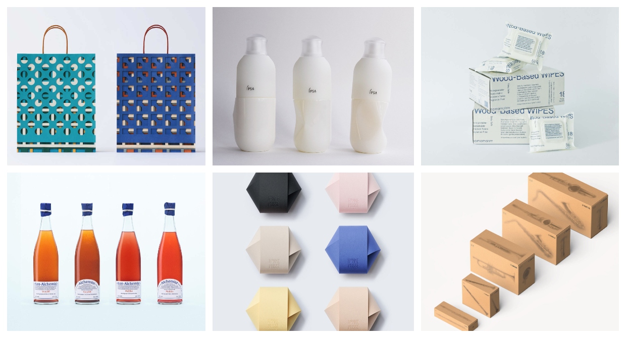
Japan has a rich history of packaging design that dates back hundreds of years and rooted in a tradition of gift-giving. Before industrial materials like plastic and cardboard, gifts were wrapped in straw, bamboo, leaves and paper: an art unto itself that lives on today in the form of products often wrapped in as many physical as symbolic layers.
Every two years the JPDA (Japan Packaging Design Association) combs through over 1000 submissions to celebrate excellence in packaging design. Here are the winners for 2027.
Grand Prize
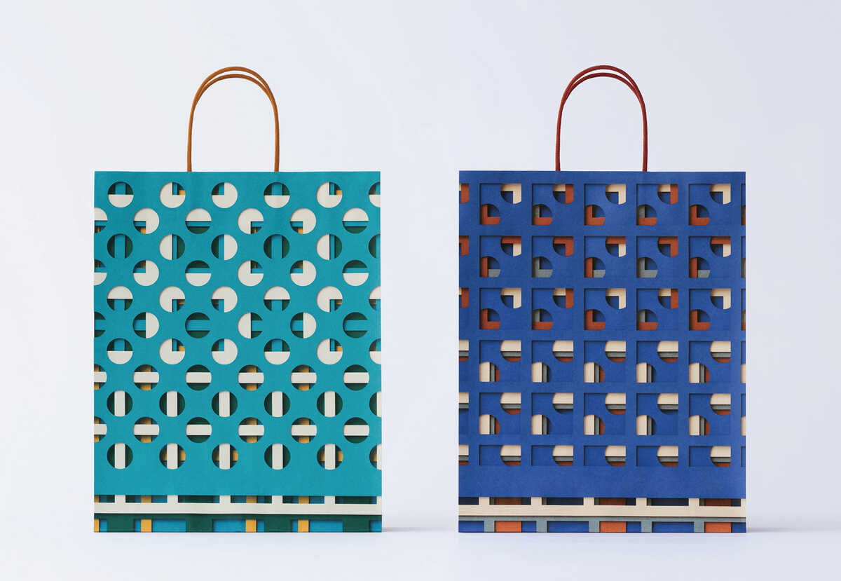
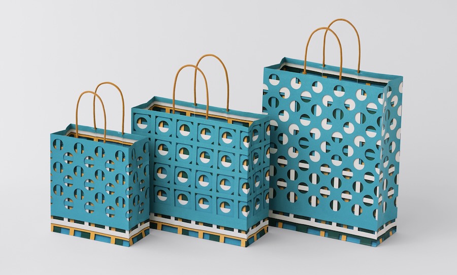
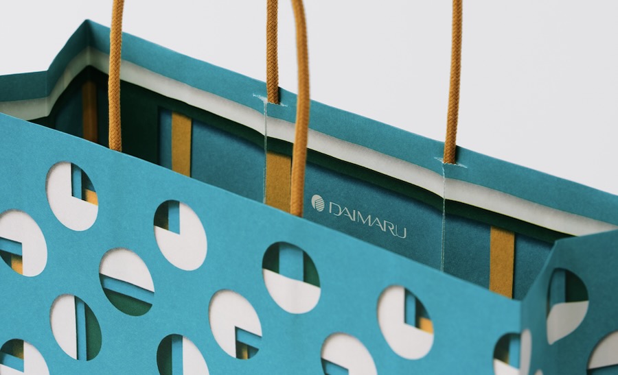
Daimaru Matsuzakaya Department Store Shopping Bags
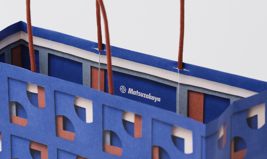
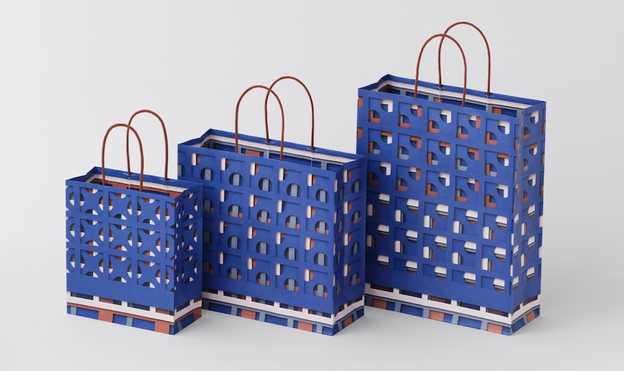
The top prize went to creative director Haruka Misawa, of the Nippon Design Institute, for her shopping bags created as part of a new visual identity for Daimaru Matsuzakaya Department Stores. More than 300 years after their founding, Daimaru and Matsuzakaya continue to share a common set of values, while their 15 stores across Japan have each developed a distinct regional character as a department store “without a flagship.”
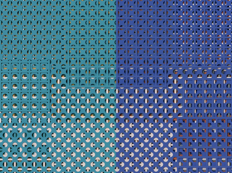
In response, Misawa created and coined hyakuyozu (百様図), a visual langauge formed simply by layering sheets of colored paper with circular and square cutouts. Within these overlapping shapes, endless patterns emerge. Move just one sheet and the entire composition transforms. After layering the paper by hand, the resulting compositions were photographed and translated into shopping bags.
Non-Alchemist / Alchemist
Gold prize in the beverage category went to KAAKA, the design agency of creative director duo Ryosuke Kato and Chihiro Kato.
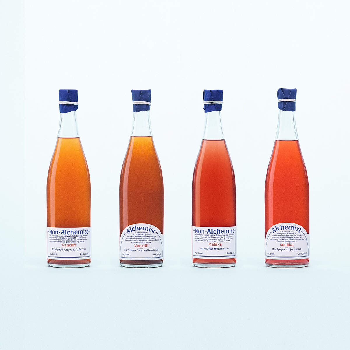
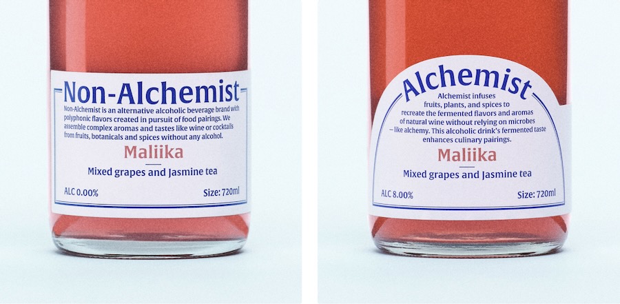
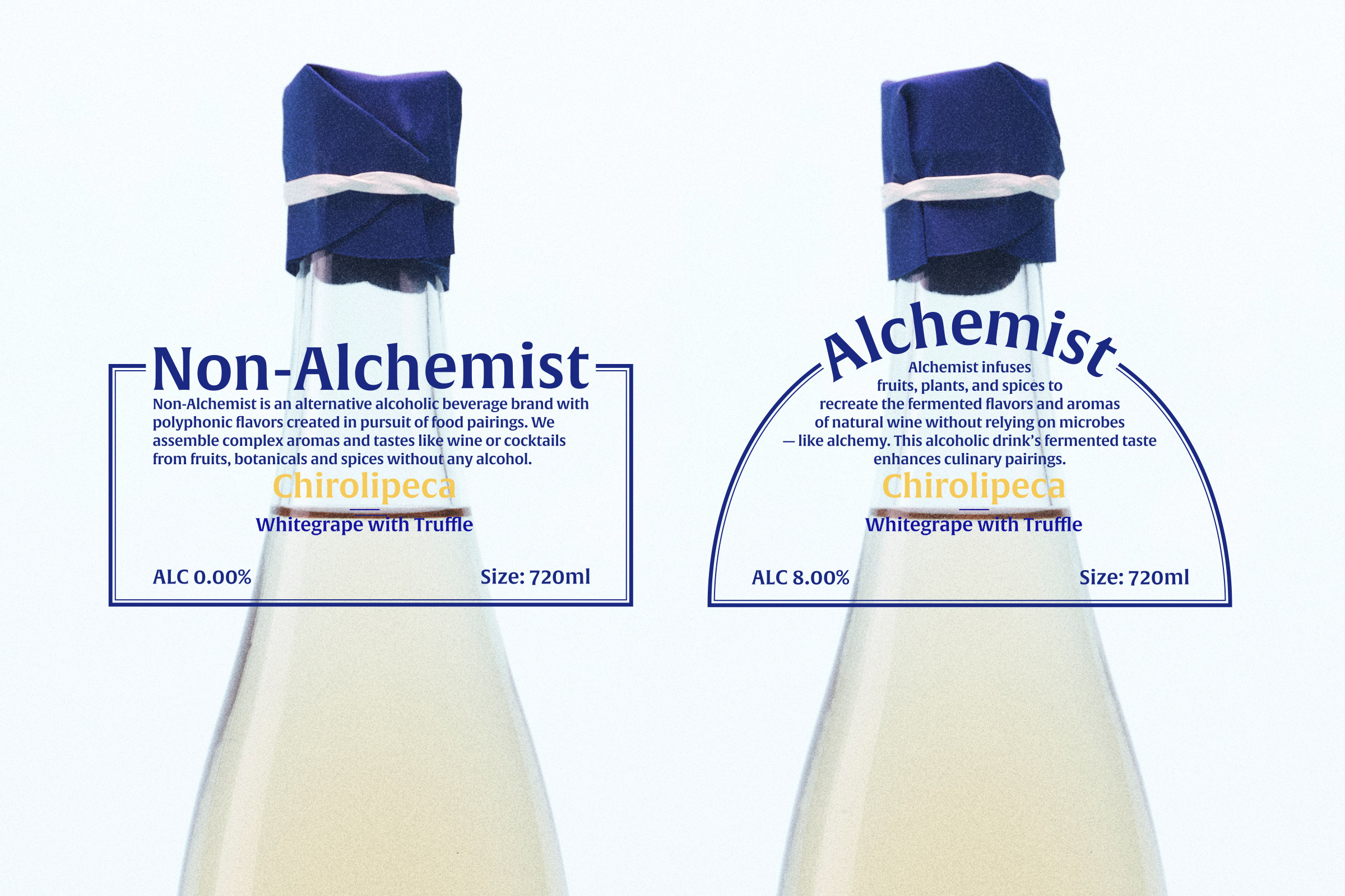
“Alchemist / Non-Alchemist” is an alternative beverage brand that produces both alcoholic and non-alcoholic drinks from the same ingredients. Rather than making the presence or absence of alcohol the focus of the experience, that principle is embedded in the structure of the packaging design. The labels are designed to position the alcoholic and non-alcoholic versions side by side as equals. Since the drinks are intended for pairing with food, the design references the conventions of wine labels while using the label’s width and proportions to create a distinctive presence for an alternative beverage.
The cobalt blue used for the typography and bottle neck label contrasts with the Bordeaux-colored liquid, giving the design a contemporary feel. Yupo paper is used for the labels, creating a smooth, uniform texture that flows seamlessly into the glass while emphasizing the bottle’s elegant lines. Rather than layering on decorative elements, the design establishes its character through the relationship between form and color.
IPSA
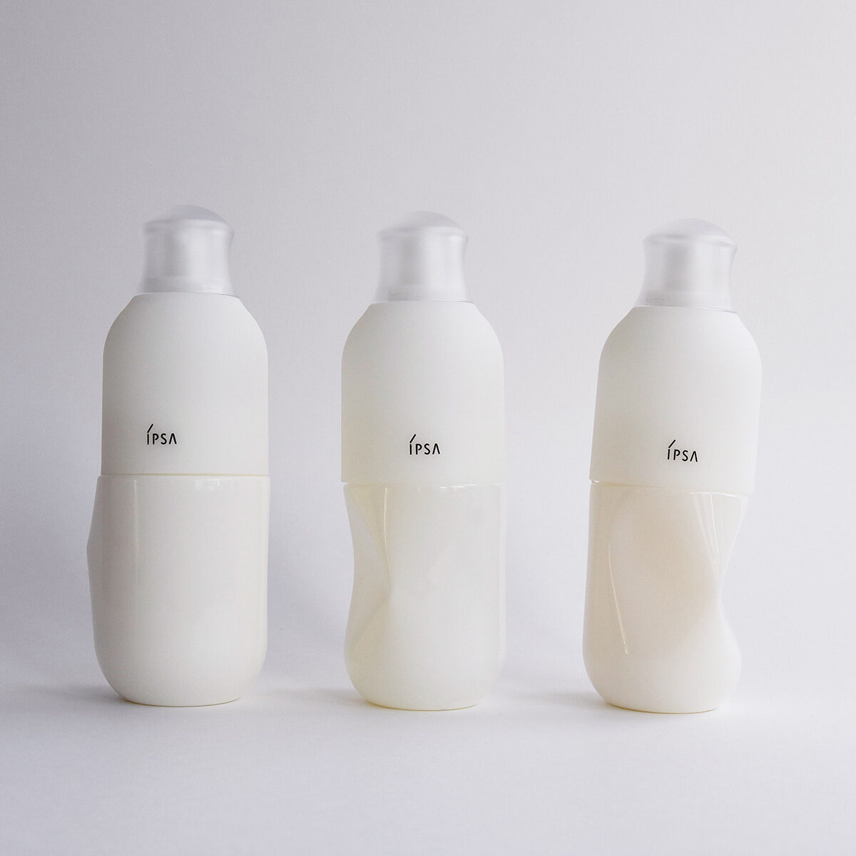
The top award in the cosmetics category went to Communication Design Laboratory for their reimagining of cosmetics packaging for IPSA, a premium, personalized skincare and cosmetics brand owned by Shiseido.
The most defining feature is how the container visibly deforms and “dents” as it is used. Rather than viewing this as a defect, the packaging positively reframes it as a beautiful record of the user’s personal journey and interaction. This design is not static; it is a dynamic process that evolves. Through the user’s touch, it makes the user a “co-creator” of the product’s final form.
Wood-Based WIPES
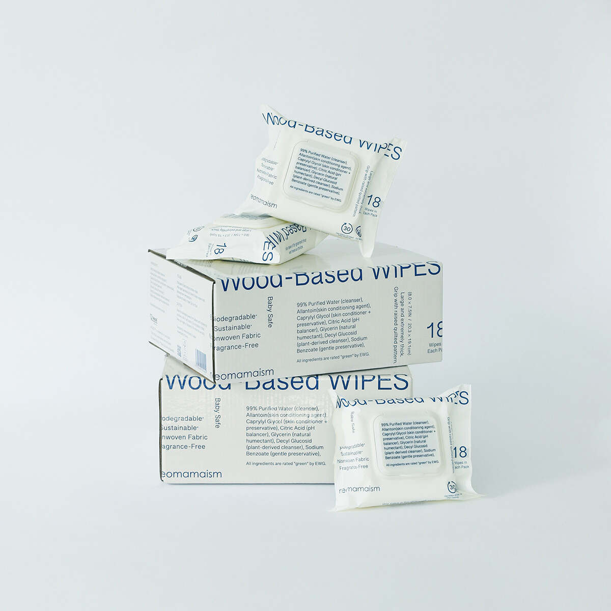
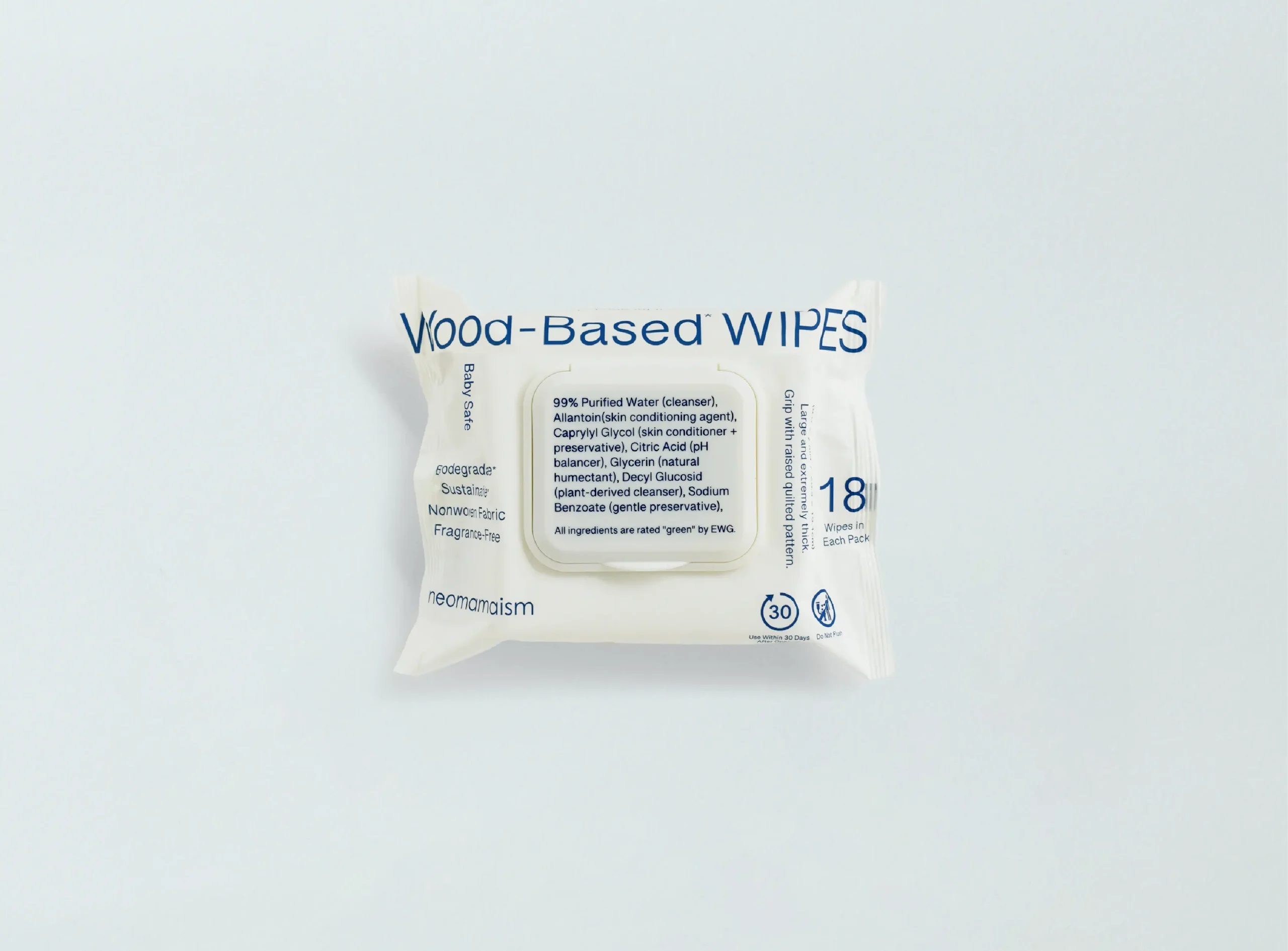
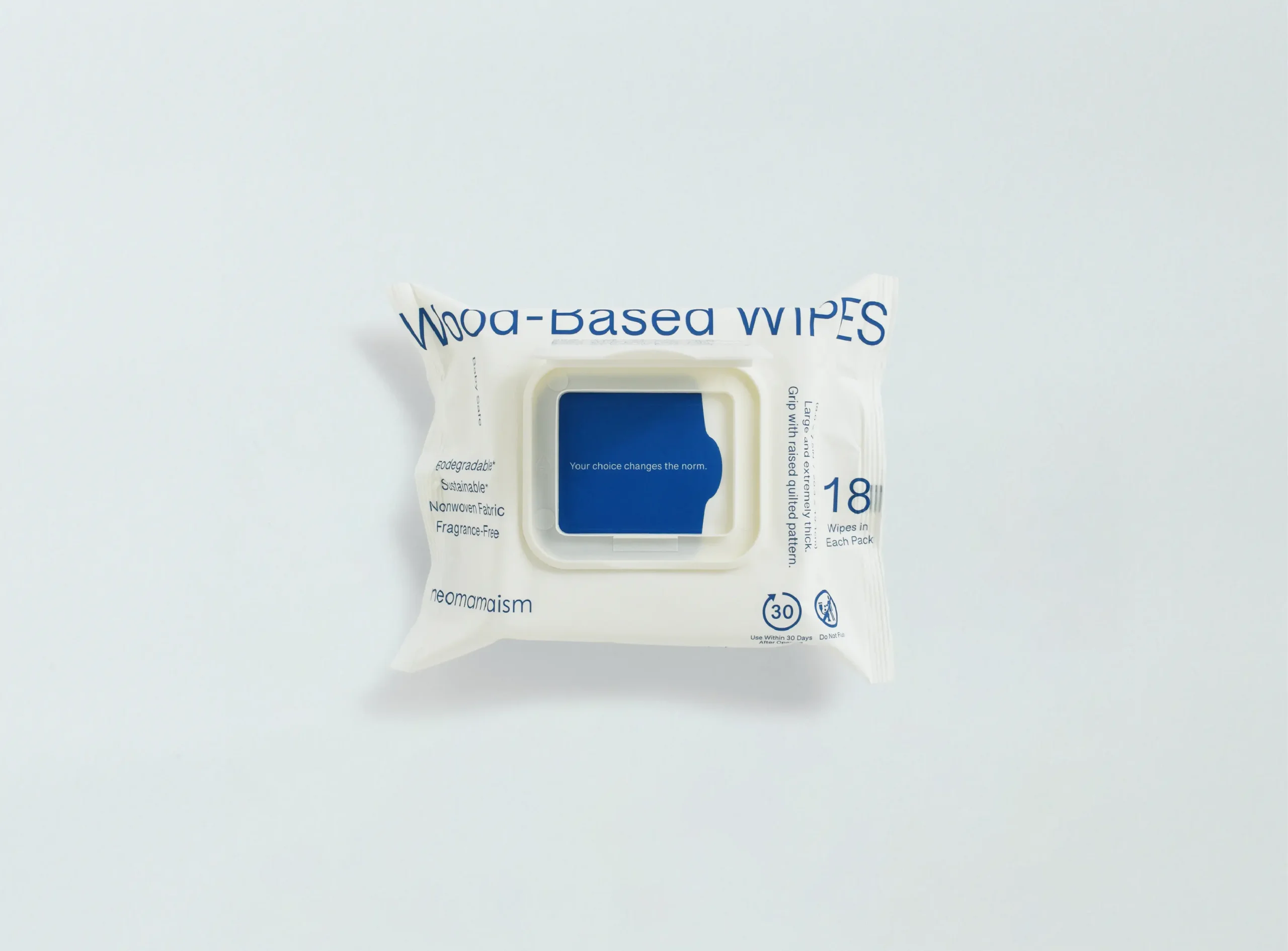
In the body & healthcare category, the gold went to Agata Yamaguchi of design agency Colle, for his work on Wood-Based WIPES, a premium, eco-friendly brand of wet wipes made from 100% biodegradable wood-based fibers and 99% pure EDI water.
“In Japan, a sense of safety is often derived from familiar claims such as “99% purified water,” “Made in Japan,” or “additive-free.” Yet we felt it was essential to draw attention to the remaining 1%. By listing every ingredient on the lid—an element that naturally enters the user’s field of vision with each use—we turned our stance on safety into a visible, integral part of the design itself.”
ANTIPASTO SCARF
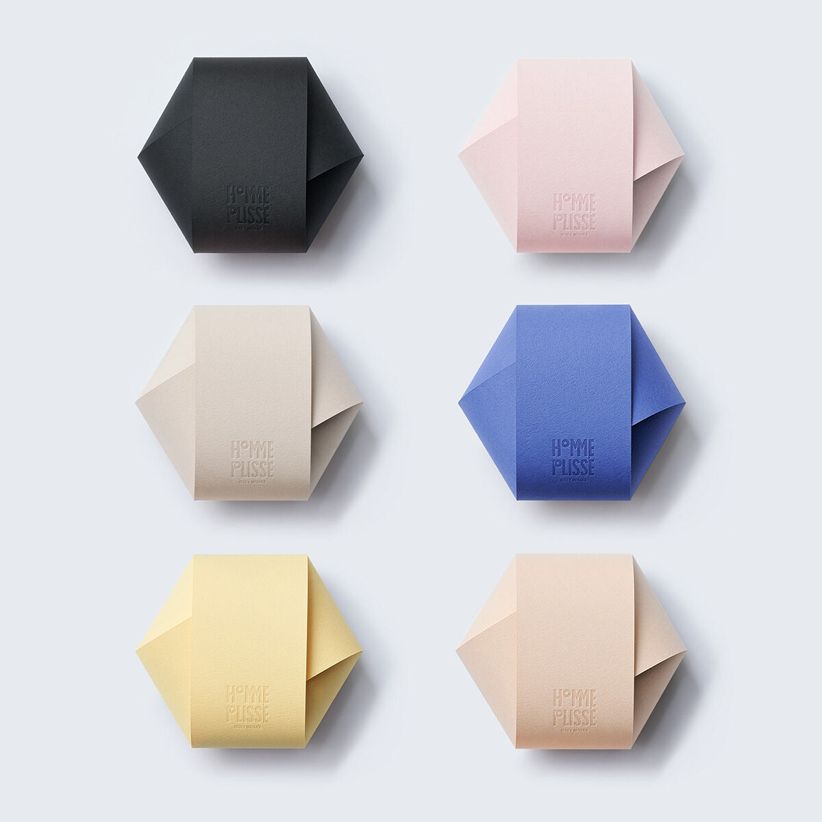
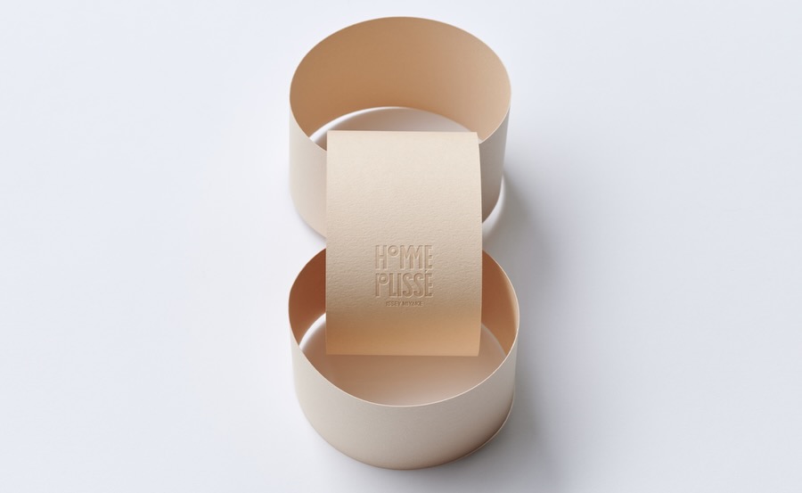
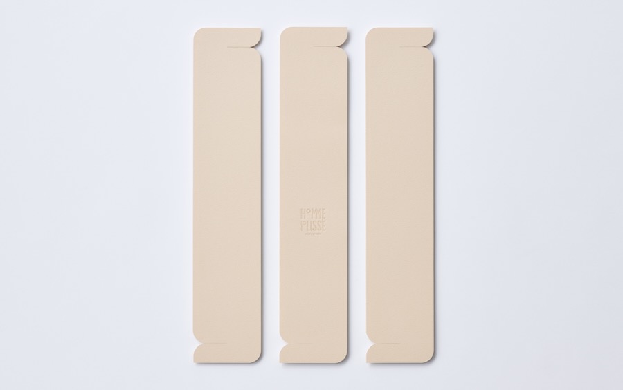
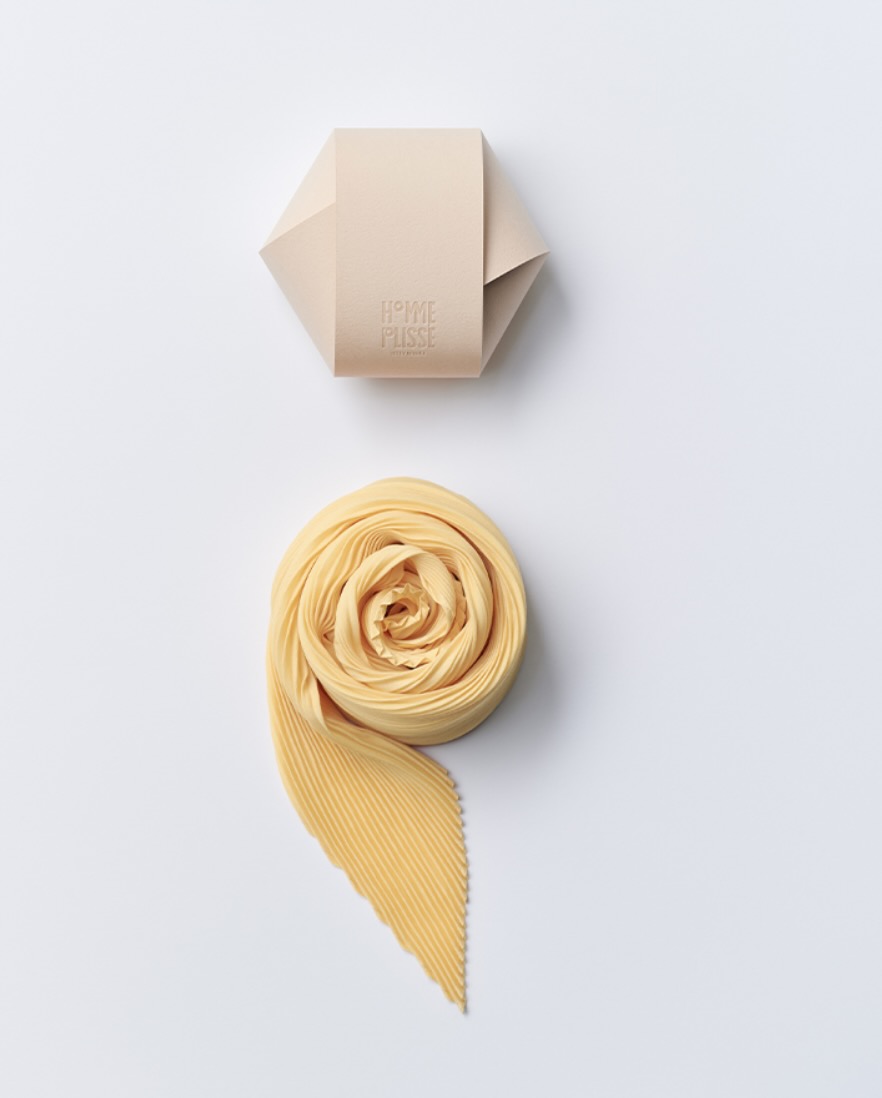
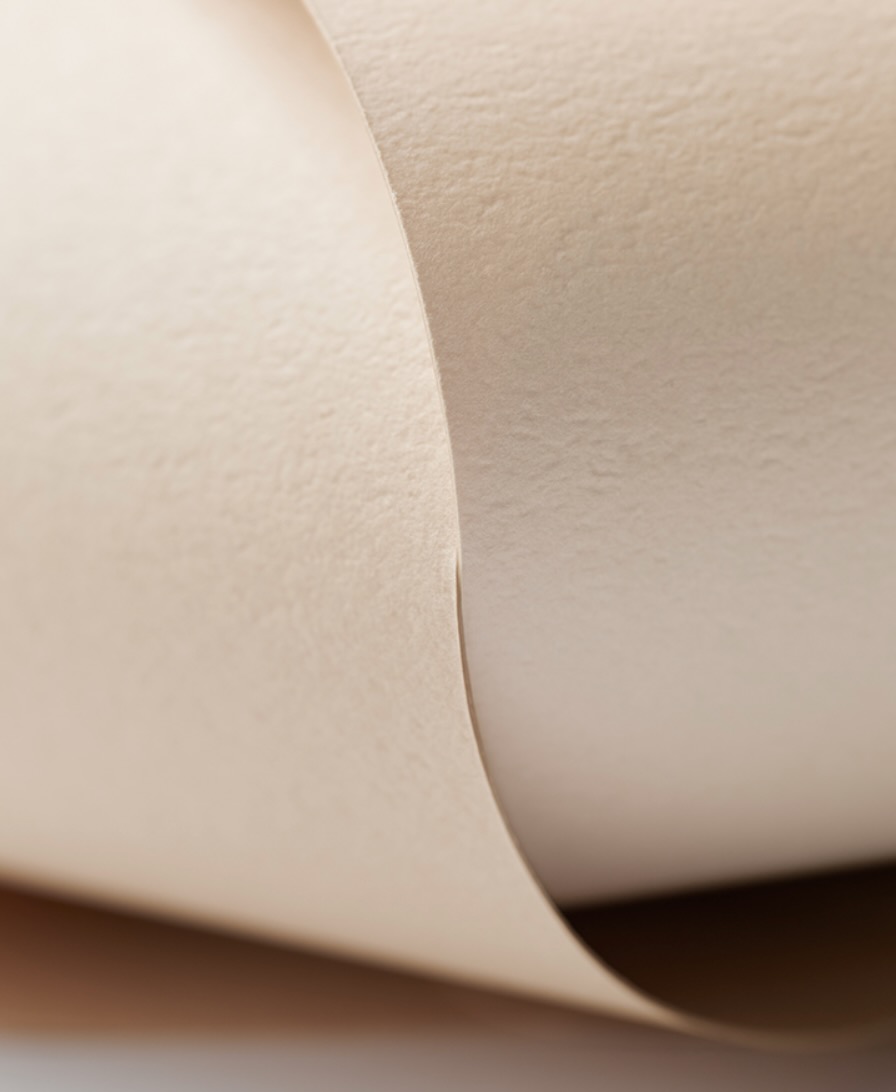
In the home category, Haruka Misawa won her second gold for her packaging design for ANTIPASTO, Issey Miyake’s new scarf series.
Inspired by the Italian appetizer antipasto, each scarf is small in size yet bold in presence, adding a touch of color to everyday life. The packaging features a surprisingly simple structure: three paper rings interlocking in circular forms gently enclosing the piece.
SEVEN SEVENTHS 2WAY GIFT PACKAGE
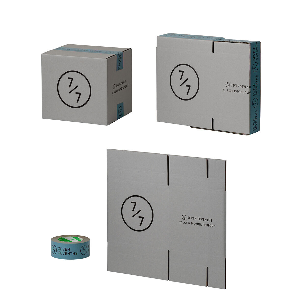
In the souvenir and gift category, the top prize went to Kentaro Ito of design firm Holballoon for their gift packaging. Created for SevenSevenths, a unique lifestyle brand by and for professional movers, the design takes inspiration from the way movers fold cardboard boxes in multiple ways depending on their needs.
Yamaha’s Entry-Level Wind Instrument Packaging
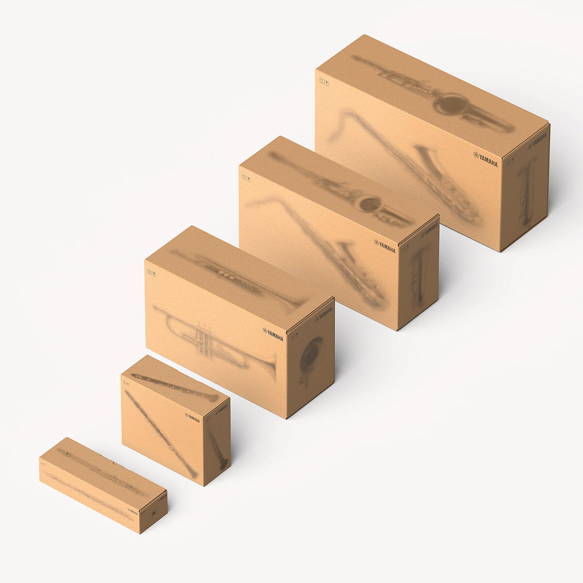
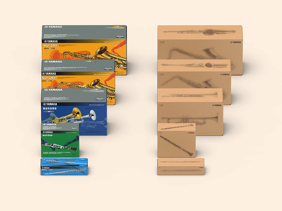
In the transportation category, Yamaha won for their in-house packaging redesign: the first of its kind in 16 years. The company, building on its efforts toward sustainability and reducing environmental impact, redesigned the packaging not merely as a container, but as an important tool for conveying the product’s value and appeal to customers. The four outer panels feature a softly blurred depiction of the instrument, as though it were enclosed in a translucent acrylic case, heightening the anticipation before the box is opened, and the excitement of when the instrument is held for the first time. This also fosters a lasting attachment to the instrument and encourages long-term care.
New printing methods and the use of recycled paper in the packaging also contributes environmental benefits. A comparison of the old and new packaging can be seen in the second image.








Leave a Reply