Page 224 of 406

Tama – the station master cat who raised over $10 million and helped save a train line

station master tama 2

 “The moment I met eyes with Tama, I was immediately struck with an image of Tama as station master”

station master tamastation master tama 3

In Kinokawa City (Wakayama, Japan) there’s a peculiar train station manned by Tama, a peculiar station master. And “manned” is certainly not the right word because Tama is a cat. And Kishi Station is perhaps the only station in the world where work has been outsourced to our feline friends.

The cat’s tale begins in 2003 when a small railroad company, struggling to stay afloat, was consolidated with another railroad company forming Wakayama Electric Railway. One victim of this consolidation was a small cat shelter that was eventually told to vacate the premises in order to make way for new roads leading to train stations. In 2006, the old woman who had looked after the cats approached the president of the railway after an opening ceremony with a desperate plea: to let the cats, who were now facing eviction, live inside the station.

“The moment I met eyes with Tama, I was immediately struck with an image of Tama as station master,” recalls Mitsunobu Kojima, of the sudden revelation that would come to transform his railway. Although Kojima had generally been a dog person, he saw Tama as a maneki-neko (literally, beckoning cat), a Japanese lucky charm in the motif of a cat and thought to bring good business. Tama did not disappoint.

station master tama_genpi

Tama in her new office. Sometimes the power goes to her head.

station master tama_imaginebreaker 1

a special “tama train” designed by Eiji Mitooka (if you’re following our series, you should know who he is)

News of the feline station master was quickly picked up by the press and spread like wildfire. A train line that had been seeing annual decreases in ridership by over 5% suddenly saw a 10% jump in just the first year. The following year in 2008 an article published by Sankei News estimated that an increase in ridership, revenue from memorabilia like photobooks, commercial appearances, as well as a tourism boom was responsible for a combined economic impact of 1.1 billion yen.

For her hard work and dedication, in 2008 Tama was promoted to Super Station Master. She was given a brand new window office, a hat with gold lining and a badge. Tama’s annual compensation package includes 1 years’ worth of cat food.

[UPDATE] Tama passed away in June of 2015. She will be missed.

Tama starring in an Aflac commercial

station master tama_setsuna

Tama relaxing after a long day’s work

(Photos courtesy: Wakayama City, Genpi, Setsuna)

This post is part of week-long series on trains in Japan. The complete series can be found here.

Riding the Yamanote Line Railway Stamp Rally

This article originally appeared in PingMag. All text and photos © PingMag.

Have you heard of train station stamps? These stamps can often be seen at major sightseeing spots as a way for people to commemorate their visit — but it’s not just tourist sites, you know. Regular stations also have these stamps.

Even though you may use a station every day as part of your commute to work or school, it’s likely you have no idea where the stamp is located. But go and take a look at the stamp in your local station and you’ll likely find it more interesting than you might think.

On the 400th anniversary of the Edo Shogunate in 2003, the stamps were expanded to all seventy-seven stations in the Tokyo metropolitan area. Not surprisingly, the theme for a lot of them is Edo-era Tokyo and the stamps often depict places connected to the station’s locale from that period in history.

Well, it’s also the fiftieth anniversary of the JR Yamanote Line this year and, given that PingMag’s offices are only a stone’s throw from Uguisudani Station, we decided to take a trip on the line, doing a complete loop and collecting the stamps at every stop.

stampnote

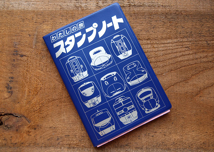
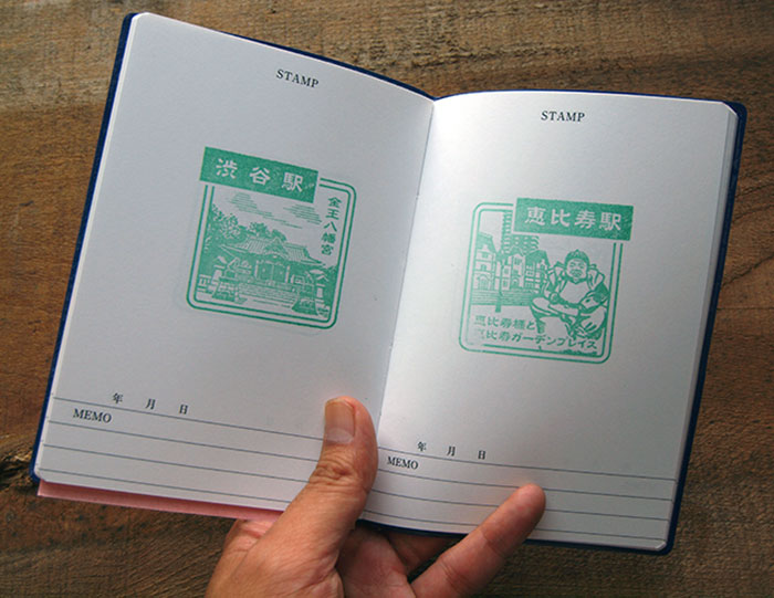
We first got our hands on this rather retro and cute “My Trip Stamp Notebook” to record our stamp rally.
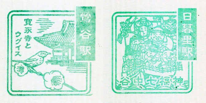
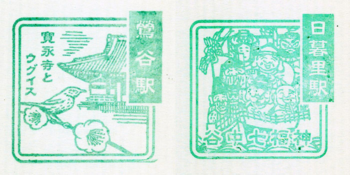
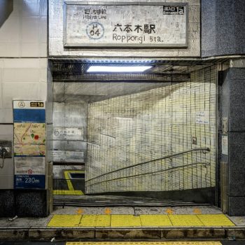
 uguisudani-nippori

Uguisudani

The name for this station derives from the nightingales (uguisu) that were brought here from Kyoto. Unfortunately you won’t be able to hear any nightingales in Uguisudani today, though the rather gaudy decoration on the table with the stamp at the station is pretty striking.

Nippori

The stamp shows the Seven Gods of Fortune, which isn’t so surprising when we consider that Nippori lies between Tabata and Ueno, where there are seven temples enshrined with the gods. Give your stamp a firm press to make the gods’ jolly features really stand out.
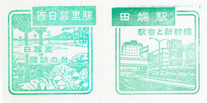
nishinippori-tabata

Nishi-Nippori

Nishi-Nippori is the newest station on the Yamanote Line. The stamp shows the view from Suwa promontory, as featured in Utagawa Hiroshige’s famed ukiyoe woodblock print series, ‘One Hundred Famous Views of Edo’. Apparently you could have seen the distant Mt. Tsukuba from the precincts of Suwa Shrine.

Tabata

Tabata is where the Shinkansen trains “live” and from station you can take a look at the carriages being loaded and unloaded from the yard. The stamp shows the station building at the north entrance, which opened in 2008. It’s fun to spot the details to — look at how the station sign in the bottom right is perfectly rendered.
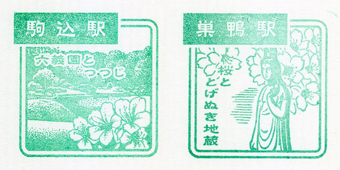
komagome-sugamo

Komagome

The azaleas at Rikugi-en (the gardens located at Komagome) are just like the ones that were popular in the Edo era, and are at their best from the second half of April to late May. Oh, and the station “melody” (all JR Yamanote Line stations have different melodies to announce that trains are about to depart) is a famous nursery rhyme.

Sugamo

Sugamo, the Harajuku for grannies. The stamp shows a special statue of the Kannon Buddhist deity that if you wipe with a wet towel in a place that needs curing, it might just yield results.
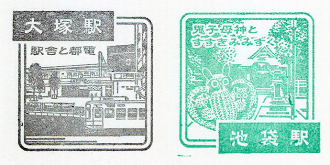
otsuka-ikebukuro

Otsuka

The stamp shows the Toden Arakawa Line, the only streetcar that runs in Tokyo. The Otsuka Station building was also a rare example of a wooden structure on the Yamanote Line but sadly was dismantled in 2008, and the stamp shows the new Otsuka Station. For some reason or other Otsuka was also the only station on the line with black ink for the stamps. Perhaps this has some sort of meaning…

Ikebukuro

Susuki Mimizuku was an old folk toy from Toshima ward, an owl made from pampas grass. The stamp is detailed, even showing the workmanship on the toy.
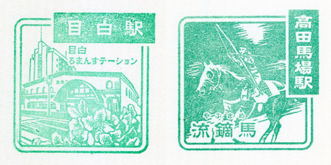
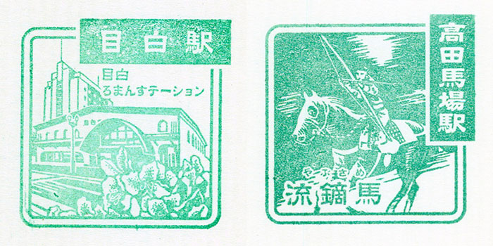
mejiro-takadanobaba

Mejiro

Here you can see the station building on the stamp, Mejiro’s third. The stained glass tower was designed to match the graceful feel of the area. Also, the table with the stamp tells you where to find the corresponding stamps in the next two stations (Ikebukuro and Takadanobaba).

Takadanobaba

The characters in the stamp spell “Yabusame“, the traditional form of Japanese mounted archery, where the rider has to shoot a series of targets some five meters away. During the Edo period the Takadanobaba area was a training ground for equestrianism and Yabusame, hence its name (baba means “hippodrome”).

The stamp gives a real sense of the impressive horsemanship in the station’s history.
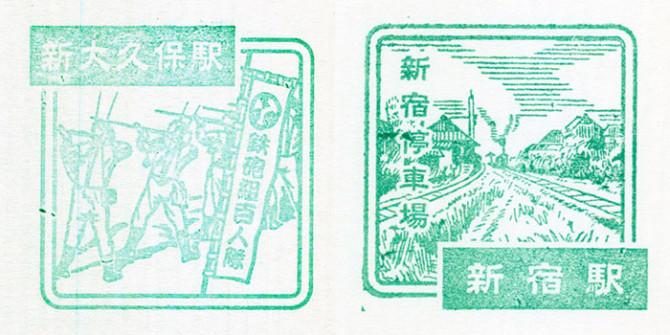
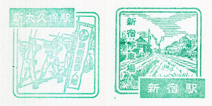
shinokubo-shinjyuku

Shin-Okubo

The scene here is of a Edo Bakufu riflemen regiment festival that happens every two years at the Kaichu Inari Shrine, west of Shin-Okubo Station. The festival uses arquebus with actual gunpowder and takes place every year in late September.

Shinjuku

Shinjuku — used daily by 3.26 million passengers, recognized by the Guinness World Records as the busiest station on the globe. Covering an area so vast it is at times more like a fortress than a railway terminus, the image of the station on the stamp is utterly unrecognizable to Shinjuku today.

The station was completed in 1885, when initially it saw a much more modest fifty passengers per day.
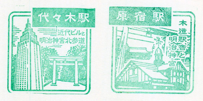
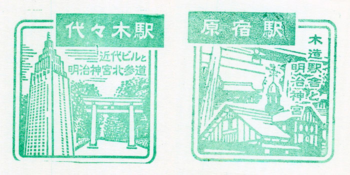
yoyogi-harajyuku

Yoyogi

The tower defining the stamp design here is the NTT Docomo Yoyogi Building. Yoyogi Station is the closest station to Meiji Shrine’s Jingukitasando, but Meiji Shrine in fact is so large there are two other stations (Harajuku, Sangubashi) closer to different parts.

Harajuku

This district is the center of youth fashion in Tokyo. The motif on the stamp is the wooden station building, but unlike Otsuka, Harajuku’s structure still stands. It was completed in 1924 and it the oldest station building in Tokyo.
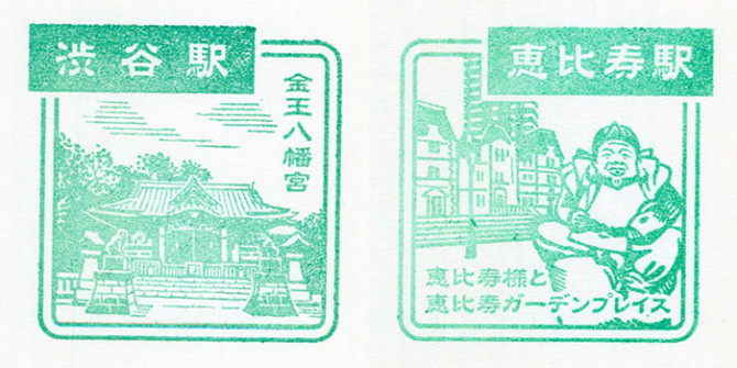
shibuya-ebisu

Shibuya

Here we can see Konno Hachimangu Shrine, five minutes’ walk from Shibuya Station’s east exit and the oldest wooden building in Shibuya ward.

Ebisu

The station name comes from Yebisu Beer, made and sold by Japan Beer Brewery Company (now merged with Sapporo Beer), and the stamp shows the statue of the god Ebisu that you can find just outside the station’s west entrance. Be sure to stamp your pass properly so Ebisu looks nice and dignified!
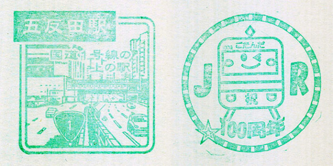
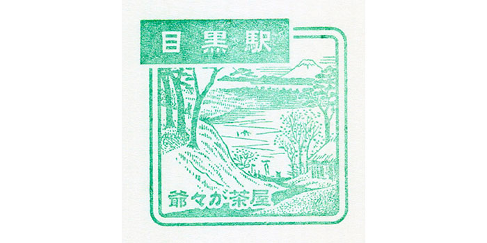
meguro

gotanda

Gotanda

Gotanda’s stamp changed in 2011 to mark the station’s centenary. The cars on the roads look like Microcars! There was also a special centenary stamp so we stamped both!
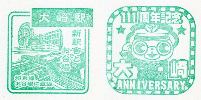
osaki

Ozaki

In contrast to Meguro’s pastoral scene, Ozaki’s stamp is super modern. Wow, you can see how the times change. You won’t find this at Ozaki itself, though, since it’s actually Palette Town in Odaiba, the Tokyo Bay development that you can get to from Ozaki.

Oh, and Ozaki Station also had a special 111th anniversary stamp so we included that too.
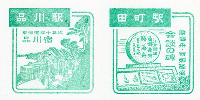
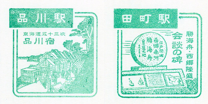
shinagawa-tamachi

Shingawa

Shingawa is again not, as you might think, in Shinagawa ward, but actually lies in Minato ward. Shinagawa-juku was one of the stopping points on the fifty-three stations of the Tokaido Highway, so the stamp features a scene from the famous Hiroshige woodcut print series.

Tamachi

It was here that Kaishu Katsu and Saigo Takamori met and agreed on the unconditional (and bloodless) surrender of Edo during the Meiji Restoration. The stamp shows the monument to this epoch-making event.
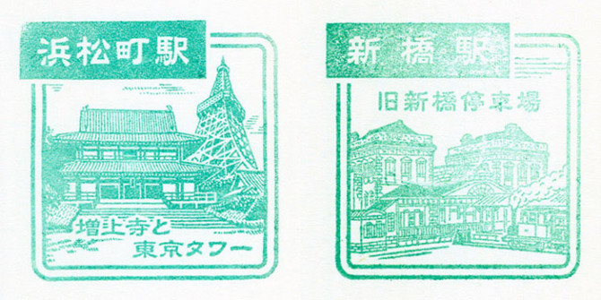
hamamatsucho-shinbashi

Hamamatsucho

Tower Tokyo may well these days be languishing in the shadow of the newer Tokyo Sky Tree, but in this stamp at least the symbol of the city still looks very impressive.

Shimbashi

Japan’s first railway started running from here back in 1872. And you can’t think of Shimbashi without thinking of the locomotive that sits in the plaza in front of the station.
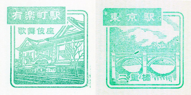
yurakucho-tokyo

Yurakucho

Here we have not the station but the Kabuki-za theatre, which was re-built for the fifth time and opened again this spring. Unlike the new architecture with its office complex integrated into the theatre, this image nostalgically indulges us with the older version.

Tokyo

This is the famous Nijubashi bridge at the Imperial Palace, near to Tokyo Station. See how it is reflected picturesquely in the water of the moat. If you apply in advance you can go across the bridge.
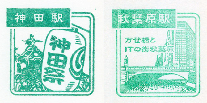
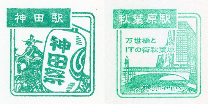
kanda-akihabara

Kanda

The Kanda Matsuri is one of the three great festivals of Tokyo and also one for the three greatest matsuri in all Japan. In the stamp you can feel the energy of the festival crowds.

Akihabara

Akihabara is a place that attracts many visitors for its unique culture. Some people might find it a bit of a mess, but we think there’s some nice symmetry here, with the parapets of the bridge lighting up the Denki-gai electronics market.
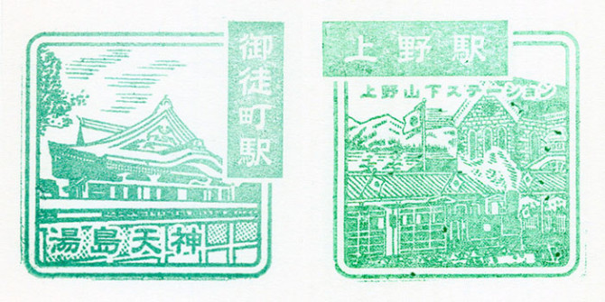
okachimachi-ueno

Okachimachi

Walk eight minutes from the north exit of this station and you come to Yushima Tenjin, the shrine we see here. It is dedicated to the god of scholarship, the poet and courtier Michizane Sugawara. It gets packed with students during the exams season.

Ueno

Our last stop. We wondered if the stamp would be cherry blossoms (Ueno Park is famous for cherry blossom viewing) or a panda (Ueno Zoo, natch). Actually the stamp is rather detailed and shows how the station looked when it first opened in 1883. We’re curious about all the flags and think it makes an interesting comparison with the Shimbashi stamp.

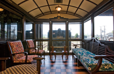
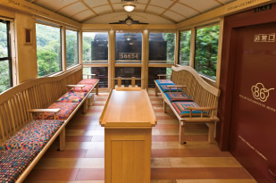
Journey’s end. This year it’s the fiftieth anniversary of the Yamanote Line so while you do your own circuit to collect the stamps, you might also be lucky enough to see one of the special anniversary trains running along the tracks.

stampnote2

This post is part of week-long series on trains in Japan. The complete series can be found here.

The Genealogy of Japanese Shinkansens

Twenty six years ago in 1987, the JR Group was formed to take over the assets and operations of the government-owned railways. At the time there was the 0 series, the 100 series and the 200 series of Shinkansen trainsets. And while the 0 series, which had been around since 1964, were formally withdrawn in 2008, the 3 original series has since grown to a total of 13.

800px-Shinkansen_Series0_R67_JNRcolorThe 0 series Shinkansen (1964) | all images courtesy Wikimedia commons | click images to enlarge

800px-100_V9_Grand_Hikari_Tokyo_199701800px-JR_East_Shinkansen_200(renewal)

The Green Trains

Seen above is the 100 series (left) and the 200 series (right), the original grandfather trains. From here, Shinkansen can largely be grouped into 2 categories. The first category includes the 200, 400, E1, E2, E3, E4 and E5 series. They are typically color coordinated with green to match the color of their operators logo. These trains were designed specifically to run through cold weather conditions in the north – areas like Joetsu, Nagano, Yamagata and Akita. Special design consideration were made to ensure that the trains were not only well insulated, but could also speed through snowfall.

800px-Tsubasa_422-6The 400 series (1992)

JReastE1_Omiya_20120918The E1 series (1994) was withdrawn from service in 2012.

800px-E2+E3kei0bandai_omiya
The E2 series (1997)

800px-E4+E3_1000_omiya800px-E3_komachi_2

Seen above are the E4 series (left) and the E3 series (right). The E series were all introduced as commuter cars, and typically featured double-decker cars for more capacity. As a general rule, a larger number indicates an improvement made on a smaller number.  For example, the E4 is an improved version based on the E1, allowing for faster speeds while still maintaining the same or less friction while traveling.

800px-JRE-TEC-E5_omiyaThe E5 series (2011) is currently the most advanced shinkansen running. It’s an improved model based on the N700 and can travel up to 320 km/hr (200 mph).

The Orange Trains

On the other side of the spectrum are the 0, 100, 300, 500, 700, 800 and N700 series, which travel in warmer climates and don’t require the same considerations as it’s Northern brethren. Until the most recent E5, the N700 was the most advanced shinkansen. Not only can it travel 300 kph (186 mph) through the mountainous curves of Tokaido, but it’s also equipped with pendulum cars – a revolutionary system that automatically adjusts the tilt of the car as it speeds around curves.

793px-JRW_Shinkansen_Series_300_F6The 300 series (1992)

800px-JRW-500-nozomiThe 500 series (1997)

800px-JR_Central_Shinkansen_700The 700 series (1999)

Kyusyushinkansen_type800_shinminamataThe 800 series (2004), aka Tsubame

800px-JRC_N700_series_Z28The N700 series

This post is part of week-long series on trains in Japan. The complete series can be found here.

How Privatization Spawned a Designer Train Movement

main_img

all images courtesy JR Kyushu

This week we’re doing an entire feature on trains – that means of transportation that holds a special place in the hearts of adults and children alike. And whether it’s high-speed bullets, old school locomotives or designer sleeper cars, no country obsesses over trains quite like Japan. So let’s begin our adventure down the rail road starting in Kyushu, the southernmost island of Japan, where the train industry, affected by extraneous circumstances, has evolved on a completely different track compared to its peers.

How Privatization Spawned a Designer Train Movement

The year was 1987. Japan was in the midst of a bubble economy and prime minister Yasuhiro Nakasone was pushing through the privatization of state-owned companies. It was a tumultuous time for railways and unprofitable lines were being ruthlessly abandoned. The stakes were high as companies faced extinction. It was just such an environment that pushed Kyushu Railway Company (JR Kyushu) to make the ultimate gamble and institute revolutionary reform. After all, their survival was on the line.

At the heart of reform was a strong will to create a unique train that only JR Kyushu could produce. To tackle this feat the man they approached was Eiji Mitooka, an illustrator and industrial designer working in Kyushu. “I had never even designed a train before,” recalls Mitooka, “but they told me I was free to design it however I wanted. I realized that, in order to escape from the generic form of trains at the time, I had to instill a completely new set of values.” The result – the Aqua Express unveiled in 1988 – single highhandedly kick-started a designer train revolution that continued to blossom throughout the years.

sbar_train_routeSL Hitoyoshi

The Steam Locomotive Hitoyoshi is an old train from 1922 that underwent a drastic 4-year renovation. With billowing smoke, a powerful whistle and enough charisma to whisk you off your feet, it’s the perfect way to relive the roaring 20s.

The SL Hitoyoshi makes a 2.5 hour trip through central Kyushu.

SL hitoyoshi main_img

SL-hitoyoshi 2SL-hitoyoshi 3

SL-hitoyoshi 4SL-hitoyoshi 5

sbar_train_route (4)Tsubame

Although difficult to discern to the untrained eye, the Tsubame (aka the 800 series) is painted with traditional Japanese white, red and black colors. But even if you don’t notice the exterior, as soon as you walk in it’ll be clear that you are in a train designed around Japanese aesthetics. With kimono-like fabric, gold-plated walls and natural wooden blinds on the windows, the Tsubame is a true Japanese experience.

The tsubame makes a 1.5 hours trip from Northern to Southern Kyushu.

tsubame (1)

tsubame pgttl

tsubame (4)tsubame (2)

tsubame main_img (1)

A Gateway to Culture

But it wasn’t just a will to survive that fostered the creative environment around train design. Given it’s port town status, the region had always been more open to new ideas, as opposed to its more conservative counterparts. “Represented by Dejima, Kyushu is somewhat of a gateway where foreign cultures mix,” says Mitooka. “It created a climate that enabled the people of Kyushu to search for new ideas.”

sbar_train_route (1)Sonic

Boarding the metallic blue Sonic is like getting into a space station. With ambient lighting that reflects off the metallic interiors, the train is something akin to a ride at Disneyland. In fact, the front of the train almost looks like it’s a transformer. It’s just one of the many reasons that this train is the recipient of the prestigious Brunel Award for outstanding train design.

The Sonic makes a 2.5 hours trip around the Northeastern coast of Kyushu, from Hakata to Ooita.

Sonic main_img

Sonic pic01

Sonic pic02Sonic pic03

sbar_train_route (2)Hayato no Kaze

A deep black, rather nostalgic train whose name comes from The Hayato people who are believed to be the indigenous people of the land. An abundance of white wood in the interior creates a bright, modern atmosphere that complements the breathtaking observation room, where you’re welcome to come and go as you please.

Hayato no Kaze makes a scenic 1.5 hour trip through southern Kyushu.

hayato no kaze pgttl

hayato no kaze main_img

sbar_train_route (3)Asoboy

If you’re traveling with kids, Asoboy may be for you. And no kid-friendly train is complete without a cute mascot, the black dog kuro-chan. A spacious lounge, parent-child-seating, a mini-library, a kids café and a pool of wooden balls are just some of the amenities to keep your toddler enthralled.

Asoboy makes a 1.5 hour trip through central Kyushu.

asoboy main_img

asoboy pgttl

asoboy pic05asoboy pic11

asoboy pic06asoboy pic09

Resources and suggested reading:

(all quotes have been translated from Japanese to English by the author)

This post is part of week-long series on trains in Japan. The complete series can be found here.

Taking Back the Aesthetics of Japan

eisuke tachikawa ted talk (1)

Back in May of this year, Eisuke Tachikawa walked up onto the stage of TedxTokyo with a large “EXIT” sign. He propped it up, only to push it down, startling audience members as it crashed to the floor. The designer, who runs a Japan-based design firm called Nosigner, was making a point about aesthetics, but also about harmony. “Japan is a beautiful country, don’t you think?” he said, beginning his talk. “But it’s not because Japan designs beautiful things. I think it’s because Japan designs harmony amongst those things.”

By “harmony” Tachikawa was referring to Japan’s mighty ability to combine different values, different mediums, different points of view, and different positions, and unite them on a higher level. However, as he went on to argue in his talk titled “Take back the aesthetics of Japan,” this harmony has been disrupted. Some of Japan’s most beautiful landmarks have been disrupted – ruined, even – by ugly and unnecessary signage. “Harmony is to be valued” (和を以て貴しとなす) he said, invoking a phrase from the Seventeen-Article Constitution set forth by Prince Shōtoku in the 7th century.

eisuke tachikawa ted talk (2)

This is a sign pointing to the tombstone of the great Oda Nobunaga, who single-handedly unified Japan under the shogunate in the late 16th century. “I think this would call for seppuku!”

eisuke tachikawa ted talk (3)

On the beautiful site of this ancient temple, the only thing that our generation made was this dingy sign, Tachikawa pointed out. “Are we ok with this?”

eisuke tachikawa ted talk (4)

“I understand they’re doing construction, but is this really necessary?”

eisuke tachikawa ted talk (5)

“What are we trying to show here,” he asked in exasperation. “Isn’t it the castle??”

eisuke tachikawa ted talk (6)

Amongst all this disharmony, Tachikawa identified an opportunity. “We need to take back what our ancestors left us.”

Two months later he was in Shodoshima, a small island in the Seto Inland Sea, for a project he called “Signage for Heritage.” Invited on a residency program, the staff of Nosigner were there on a mission. For 10 days they stayed there, working with the priests and keepers of three different shrines to come up with better solutions and restore some of the beauty that had been lost. “In thinking about harmony on this holy site,” they wrote, “we want to discuss with you how we can create a better environment to connect people with the space.”

Below are some progress shots, which I think look amazing. You can see more before/after shots and observe their progress over on their tumblr.

signage for heritage (1)

signage for heritage (2)

signage for heritage (3)

signage for heritage (4)signage for heritage (5)

signage for heritage (6)

signage for heritage (7)

signage for heritage (8)

signage for heritage (9)

signage for heritage (10)

signage for heritage (11)

600 octopi made from recycled newspaper by Natsuko Kogure

natsuko kogure paper octopi (5) natsuko kogure paper octopi (4) natsuko kogure paper octopi (3)

natsuko kogure paper octopi (1)

Japanese artist Natsuko Kogure uses recycled newspaper to create quirky, often humorous sea life. She turns her paper creations into everything from whales and blowfish to sea cucumbers and hermit crabs, often photographing the results on actual beaches. But for an exhibition at Gallery Le Bain in Roppongi that just opened yesterday, the artist is displaying 600 octopi that she’s created over the years.

You can see the colorful creations (hard to believe it’s all newspaper!) through the weekend until August 11.

natsuko kogure paper octopi (9) natsuko kogure paper octopi (8) natsuko kogure paper octopi (7) natsuko kogure paper octopi (6)

source: PEN

ArKhe | a beauty salon inspired by Greek philosophy

arkhe1photos by atsushi ishida /nacasa & partners | click to enlarge

According to Greek philosophy, arkhe was the cosmos or everything, and was often interpreted as referring to the element of water which, in turn, gives life to everything. Based on that concept, architect Moriyuki Ochiai designed a Beauty Salon just east of Tokyo using recyclable aluminum sheets to express the flow of water.

The detachable aluminum reflects light like the sparkling surface of a stream and “fills the space with elegant and sensual curves,” says the architects. “Water is the source of all life, and this space projects an image of clarity as a beauty salon in pursuit of the origin of beauty.”

arkhe2

The flexible aluminum sheets can be easily detached from the ceiling and rearranged. This was also a consideration for the potential of relocating – the can be easily reinstalled in a new location, effectively reducing the cost of moving.

arkhe3

arkhe5arkhe7

ArKhe has been added to our collection of beauty salon architecture.

arkhe6

source: submission

From Here to There | the art of asking for directions

Aozaki_Nobutaka_01

Outfitted in a souvenir baseball cap and Century 21 shopping bag, Japanese artist Nobutaka Aozaki hits the streets of Manhattan, asking strangers for directions wherever he goes. However, Aozaki is not a tourist nor does he have a horrible sense of direction. This is “From Here to There,” an ongoing art piece in which Aozaki is constructing a map of Manhattan based on hand-drawn directions people create for him.

“Sometimes my destinations come from Japanese guide books but other times they’re just where I’m headed to meet friends or, if I’m hungry, to get a bite to eat,” Aozaki tells us. The NY-based artist isn’t necessarily trying to complete the map. What’s more important is that the artistic process reflects his daily life; almost like a diary.

Aozaki_Nobutaka_02

“But this is becoming a lost form of communication,” Aozaki points out. “Most people just pull out their smartphone and try to show me a map. When this happens I tell them I’ll forgot so please draw me directions!”

Aozaki_Nobutaka_03

Personalize your Suica Penguin with decorative stickers

suica penguin stickers (5)

If you’ve ever used public transit in Japan you’ve surely encountered Suica Penguin, the adorable mascot character that appears on the front of the smart card. Designed by illustrator Chiharu Sakazaki, Suica Penguin got it’s name from the onomatopoeic phrase sui-sui, meaning to glide smoothly (through the turnstile).

Now a new set of stickers are giving straphangers a way to personalize their commuter companion. Currently available in 3 categories – wear, music and art – ic Card Wear lets you dress up Suica Penguin. Available in 15 variations (735 yen each) there’s something for everybody including art enthusiasts, revolutionaries and skaters.

suica penguin stickers (6)the art category places Suica Penguin in well-known works of art.

suica penguin stickers (1)suica penguin stickers (2)

left:  che guevara suica pengion | right: knight suica penguing

suica penguin stickers (3)suica penguin stickers (4)

left:  skater suica pengion | right: statue of liberty suica penguing

source: roomie

New Bicolor Series from SIWA

l_siwa_02

I’m a huge fan of SIWA, the collaborative washi paper project between Naoto Fukasawa and ONAO, a paper maker with over 1000 years of history. Their latest designs, hitting shelves this month, is a limited edition bicolor series that includes a tote bage, iPad holder, book cover and card case. LOVE.

l_siwa_03

l_siwa_04

l_siwa_05

Source: hitspaper

« Older posts Newer posts »

© 2026 Spoon & Tamago

Up ↑

Design by Bento Graphics