Page 207 of 406

Trick-art on Twitter: Miniature objects cut-out from everyday magazines

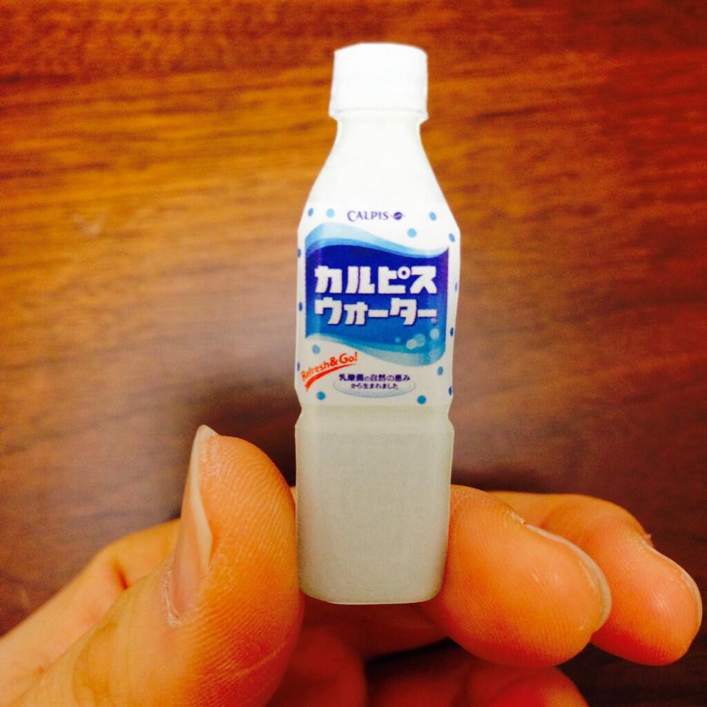
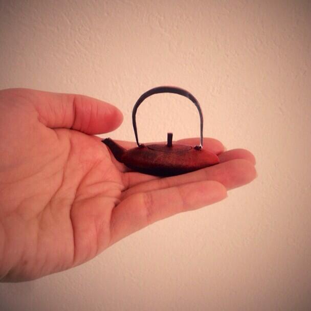
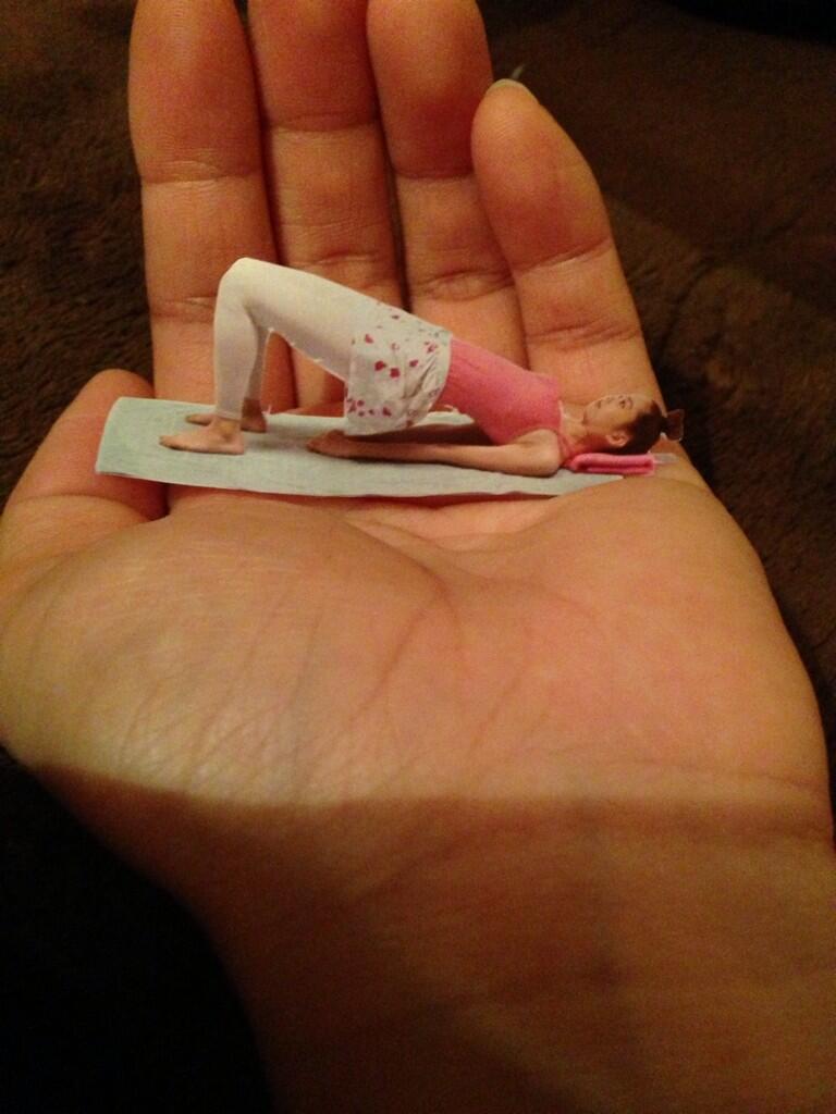
This new Twitter trend proves once again the Japanese love for small things. From Japanese gardens to Nanoblocks, Japan has always been fond of miniature reproductions of real-life objects. This time, the Japanese Internet found a creative way to make cute miniature scenes simply by cutting their favorite objects from a magazine, and placing it in their hands:

BiMapY3CUAAHrTVBiMWOnLCMAAK4vG

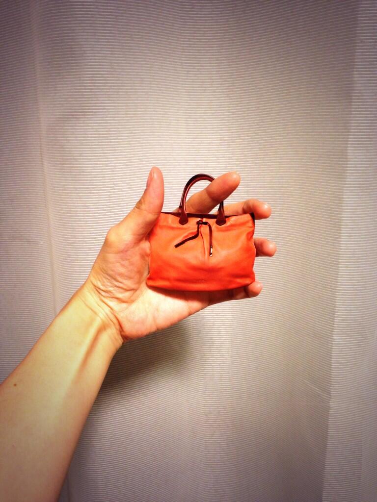
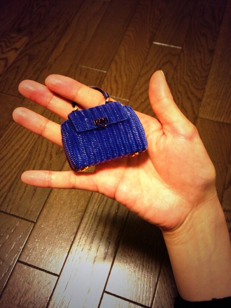
Manga-artist Yukari Takinami led the new Trick-Art trend earlier this month with a collection of shrunken handbags. The author of the popular Ekoda-chan manga was quickly followed by the Japanese Twitter community, adopting the concept with everything from tiny people to miniature elephants.

BiQfVxOCQAI5gkG

BihyAU7CAAA50m9 

Biiwzl1CMAACIrF

 Source:  @takinamiyukari via @yuk_yk. Have a look at the Twitter hashtag #撮リックアート for more submissions.

Nendo designs Starbucks mugs with coffee graphics printed on back

nendo starbucks mug (1)

After creating a pop-up shop for the coffee giant back in 2012, design firm nendo has embarked on their 2nd collaboration with Starbucks, creating a series of mugs that will be sold at stores throughout Japan. A very simple trick creates a cool effect: the bottom of the mugs are realistically printed with graphics to create the illusion that they are brimming with hot coffee.

For 1,200 yen you can get either a latte, caramel macchiato or Americano that, even when drying or sitting upside down on a shelf, can remind you that your mug is always half full.

nendo starbucks mug (4)

nendo starbucks mug (2)

nendo starbucks mug (3)

source: press release

Altus | photographs that show the beauty of white space

altus takashi suzuki (1)

Altus is a Latin adjective meaning “high, deep, noble or profound.” In a photographic body of work by the same name, Takashi Suzuki presents a series of minimal landscapes that are delicately interrupted by white space.

“In this series, my interest is in interspace and space,” says the artist. He goes on to explain that his work is about the beauty and perception of negative space or margins; even more so than the actual landscapes themselves.
Indeed, normally I would feel annoyed or turned off by such a radical gap in scenery but these photos are incredibly calming. It’s as if the negative space is supposed to be there.

Suzuki’s photos are currently part of the group show “cognition / recognition” in Tokyo that runs through 4/19/2014.


altus takashi suzuki (2)

altus takashi suzuki (3)

altus takashi suzuki (4)

altus takashi suzuki (5)

altus takashi suzuki (6)

Haptic Green | Captivating photos of trees made from hundreds of small scans

hapticgreen01

96346

Our perception of color is made possible by cone cells in our eyes. And people with normal vision have 3 cone cell types: red, green blue. Of the 6-7million, about 45% are green, which means our eyes don’t have to work as hard to perceive the color. This also means that green is the most relaxing color to look at.

But the process in which Japanese photographer Naruki Oshima created his “Haptic Green” series as hardly relaxing at all. In fact, the images come together from a complex technical process involving hundreds of smaller elements. The art historian Valérie Douniaux explains:

The process he uses is like a scan: with the camera fixed at a precise point, the artist methodically shoots a series of images starting from the bottom left corner of the frame, up to the top right-hand side. In reassembling the shots, Oshima works meticulously to correct distortions created by the fixed camera angle and to erase overlaps, in order to give the impression of a single image, a single shot…Naruki Oshima redistributes the image’s composing elements, combining close ups with long distance frames, mixing focused with blurred.

Perhaps it’s the delicate balance of calming and complexity that makes this series so intriguing. Oshima’s photos are currently part of the group show “cognition / recognition” in Tokyo that runs through 4/19/2014.

hapticgreen03

hapticgreen02

hapticgreen06

hapticgreen08

Papa’s Maze Featured in Popular Japanese Web Comic One Punch Man

Several weeks ago @Kya7y, the daughter of the creator of Papa’s Maze, got in touch with us to see if it was all right if the maze was used in a Japanese comic book. We, of course, agreed, but had no idea what comic it would appear in, or in what context. Last month it was revealed that the maze was appearing in the wildly popular web comic One-Punch Man.

In issue 42, there is a scene that cuts to the maze itself.

papas maze one punch man (1)

Then it zooms in…

papas maze one punch man (2)

Again…

papas maze one punch man (3)

And again…

papas maze one punch man (4)

Until we realize that one of the protagonists has wandered into a labyrinth that is the belly of the enemy’s spaceship.

papas maze one punch man (5)

Many thanks to everyone involved for featuring, and immortalizing, the maze. If you want your own copy, we sell them in our shop!

Monster Exhibition 2014 | a charity art show for victims of the earthquake and tsunami

monster-exhibition-recover-rebuild-840x424

monster-exhibition-recover-rebuild-hannat-architects_007monster-exhibition-recover-rebuild-hannat-architects_005

What resembles a white, monstrous reptile with pointy spikes across its entire body, wraps around a room. But this isn’t Jurassic Park. This is the 8th floor of Shibuya Hikarie department store. And the monster is actually made from folded cardboard. Its twists and turns create pathways for people to walk through, while the large body serves as display table for various monster-themes artworks.

monster-exhibition-recover-rebuild-hannat-architects_002

Monster Exhibition 2014, which just ended yesterday, was a charity art exhibition aimed at raising money for victims of the Tohoku earthquake and tsunami. Monsters are a metaphor for disaster but also power and energy. The exhibition acknowledges that disasters happen, and attempts to turn it into a strong message for the future.

Even if you missed the Tokyo exhibition, the monsters will be traveling to New York this summer for a show at hpgrp gallery.

monster2014 ryu_no_yoru

The special guest artist was Yuji Kaida, one of the most well-known “kaiju” artists in Japan, made famous by his Ultraman and Dundam illustrations.

monster gigarha


monster 000_6697-800x532

Natsumi Kaneko creates 3D sculptural scenes of imaginary monsters to depict the relentless forces of nature.


monster2014 WakabayashiYasuto

Yasuto Walabayashi depicts monsters attacking an destroying landmarks from his home town in Kanagawa.


monster2014 DAISUKE_TAJIMA

Daisuke Tajima paints post-apocalyptic urban cityscapes.


source: Design Made In Japan

Design As It Is | an answer to the overly designed product

“The definition of design has been updated – this is a new era of design,” exclaims Eisuke Tachikawa, lead designer at Nosigner and curator of “Design As It Is.” The new exhibition, which just opened at Singplural 2014, proposes a new type of design: one that shuns the overly designed visible forms and transitions to minimally designed invisible relationships. Stated differently, the physical form stays the same. The only thing that changes, or is designed, is the relationship.

Here are a few examples:

The moon as a lamp. Designed by Nosigner.

TheMoon_1

Onions as trivets. Designed by Yusuke Komatsu.

cutpiece_tamanegi_2

A light bulb as a light bulb. Designed by Hironao Tsuboi.

Lamp-Lamp_02

An apple as a toy (kendama). Designed by Yasuhiro Suzuki.

mt1004

A beam of wood as light. Designed by Nosigner.

beam_rendering

A flipbook as rainbow. Designed by Masashi Kawamura.

rainbowinyourhand_Japan_2007

source: press release

Visualizing Radiation | The Form of Fukushima

gotoh hiroyuki form of fukushima (1)

Three years ago a devastating earthquake and tsunami took the lives of 18,500 and the homes of 470,000 more. Not only that, it set off terrifying chain of events that crippled a nuclear reactor, leaking radiation into the air, ground and sea. Part of what makes radiation so dangerous is that it’s invisible, rendering it susceptible to misinformation and credibility.

Art student Hiroyuki Gotoh, who has been focusing his artwork on making the invisible, visible, became fascinated with the virality of radiation and decided to base his senior thesis exhibition on this topic. “The Form of Fukushima” (福島の形相) uses a polar graph drawing machine to visualize publicly available data on radiation levels in Fukushima. In a singularly robotic way, a pen endlessly draws on a canvas, creating a graphical portrayal that is at once beautiful, but also frightening.

“The Form of Fukushima” will be on display this weekend at Tama Art University’s graduation work exhibition.

gotoh hiroyuki form of fukushima (5)

gotoh hiroyuki form of fukushima (6)gotoh hiroyuki form of fukushima (7)

gotoh hiroyuki form of fukushima (8)

gotoh hiroyuki form of fukushima (2)

gotoh hiroyuki form of fukushima (3)

gotoh hiroyuki form of fukushima (4)

(this post is part of our review of student artwork from 2014 senior thesis exhibitions. You can see all our coverage of student artwork here)

Futon Fashion | Japanese designers present bedroom chic for Fall 2014

topfw14trends_promo1

from left to right: Comme des Garcons, Yohji Yamamoto and Junya Watanabe

This winter was cold. Brutally cold. And judging by the runway shows that Japanese fashion designers just released for the Fall 2014 season, cold was just about the only thing on their minds too. Japanese masters Rei Kawakubo (for Comme des Garcons), Yohji Yamamoto and Junya Watanabe all showcased voluminous, futon-like coats that conjure up images of warm bedding.

So if you’re trying to get ahead of next season’s trends, you don’t have to look farther than your own bedroom. However, the leading fashion designers aren’t always ahead of the curve. This guy and his wearable kotatsu one-upped them all last year.

Comme des Garçons

comme-de-garcons-rtw-fw2014-runway-11_180510534147 comme-de-garcons-rtw-fw2014-runway-04_18050522970

comme-de-garcons-rtw-fw2014-runway-15_180514843988 comme-de-garcons-rtw-fw2014-runway-14_180513298834

Yohji Yamamoto

YOHJI-YAMAMOTO-FALL-2014-RTW-4 YOHJI-YAMAMOTO-FALL-2014-RTW-3

YOHJI-YAMAMOTO-FALL-2014-RTW-2 YOHJI-YAMAMOTO-FALL-2014-RTW

Junya Watanabe

junya-watanabe-rtw-fw2014-runway-30_091936778389 junya-watanabe-rtw-fw2014-runway-29_091935650998

source: artinfo


It’s not what it seems | painted food disguised to look like other food

Its-not-what-it-seems-Hikaru-Cho-painted-food-1

Its-not-what-it-seems-Hikaru-Cho-painted-food-2

When not creating hyper-realistic body paintings, Tokyo-based artist Hikaru Cho points her paintbrush to ordinary food lying around her house. In a playful series aptly titled “It’s not what it seems,” Choo-san (as she is called) paints over foods like bananas, tomatoes and eggs, creating a brilliant disguise that presents her subjects as entirely different food.

Its-not-what-it-seems-Hikaru-Cho-painted-food-3

Its-not-what-it-seems-Hikaru-Cho-painted-food-4

The series is certainly a lot more light-hearted than her recent campaign to raise awareness for sexual exploitation. But aside from being mere eye-candy the series, on a deeper level, encourages us to look beyond what we see on the outer layers as it can be very misleading.

Its-not-what-it-seems-Hikaru-Cho-painted-food-5

Its-not-what-it-seems-Hikaru-Cho-painted-food-6
UPDATE
July 2014

hikaru-cho_1280 hikaru-cho-0lBJB11ro51udo4_1280

source: junk culture

« Older posts Newer posts »

© 2026 Spoon & Tamago

Up ↑

Design by Bento Graphics