Summer is winding down. The locusts are fetching up new breath for one, final onslaught, humidity is on its last leg and back-to-school commercials are invading the airwaves. But you can still enjoy the great outdoors while simultaneously visiting the largest art gallery in the world. Running until September 17, the Echigo-Tsumari Art Triennale is just about half-way through. But that still leaves you 3 weeks to immerse yourself in one of the largest art festivals in the world, in one of the most unlikely places in the world. Known for their heavy snowfall in winter, the Echigo-Tsumari region is located in mountainous Niigata – easily accessible from Tokyo in a little over an hour by train.
Once there, you’ll traverse 200 villages across roughly 190,000 acres, all dotted with site-specific artworks created by some 220 artists from all over the world. The organizers admit, it’s an “absolutely inefficient approach deliberately at odds with the rationalization and efficiency of modern society.” The intention is to interact with the beauty and richness of the land, which serves as a canvas for art.
Below are some of our favorite picks – a small cross-section of what you will see if you make the pilgrimage. Unless otherwise noted, all images are courtesy Echigo-Tsumari Art Field.
(Note: some works were created for previous triennials and remain standing)
Nakasato Village Juji Project (2003) by Ryo Yamada
Architect Ryo Yamada installed a foundation of colored wooden decks that interact with its surrounding nature. During summer, flowers and weeds grow through the boards while, in autumn, they transform into a canvas for fallen leaves.

photos by S. Anzai. Courtesy Ryo Yamada & Ayako Yamada


Kamaboko Storehouse Project (2003) by Tsuyoshi Ozawa
Artist and “The Group 1965” member Tsuyoshi Ozawa created a series of architectural sculptures inspired by Kamaboko Storehouses – an indigenous warehouse with a curved roof, designed to withstand heavy snowfall. The functional warehouses come with a fish-eye window so visitors can see what’s stored inside.


Reverse City (2009) by Pascale Marthine Tayou
Cameroon-born, Belgium-based artist Pascale Marthine Tayou created an installation of oversized pencils, hung at varying heights. Each is inscribed with the name of every country in the world. While awe-inspiring in its multiplicity, standing under it one is reminded of the menacing and destructive potential that each holds.


Forest (2000) by Jun Honma
Upside down pencils not your thing? Jun Honma created an installation of 7000 right-side up pencils, all collected from locals, in a kamaboko warehouse (remember those?). The forest of pencils works to merge with the real forest surrounding it.


Ikebana House (2012) by F-Nokai
The 12-member collective F-Nokai has transformed an old tea house into a large ikebana flower arrangement.


The Cosmology of Yusuke Nakahara (2012) by Tadashi Kawamata
Before his death, the art critic and triennale advisor Yusuke Nakahara donated his collection of 30,000 books. As a form of commemoration, the prominent artist and sculptor Tadashi Kawamata created an giant house-like installation using his books. An added bonus: free wifi available inside through the end of the festival.


Restructure (2006) by Harumi Yukutake
Walking down a small, grassy dirt road you will come across a house, covered in thousands of small mirrors. Depending on your perspective, the house, at times, appears to melt into its surroundings. Harumi Yukutake, known for her large-scale installations in which she covers public structures with mirrors, hand-made every mirror, which gives me a new-found respect for her art. Stepping into the house is like stepping into another dimension – one where conflicting elements like truth and deception, light and shadow, still and moving, all peacefully coexist.


Golden Teahouse (2012) by Ryo Toyofuku
Nothing is more out of place than this Golden Teahouse, in which Ryo Toyofuku covered the disheveled interior with gold paint.

0121-1110=109071 (2009) by Lee Jae-Hyo
It’s hard to believe that Lee Jae-Hyo’s geometrically soothing spheres are made only from found wood. The sculptures will eventually be consumed by the vegetation surrounding it.

images courtesy the artist


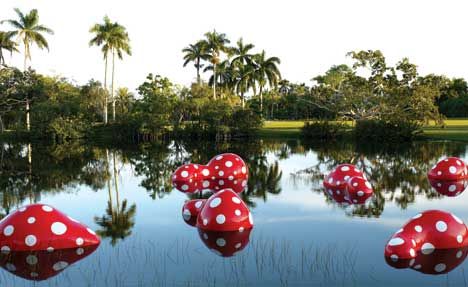
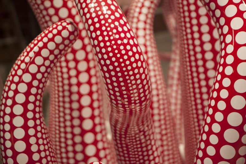
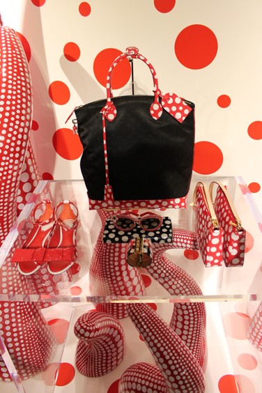
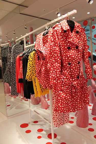
Tsumari in Bloom (2003) by Yayoi Kusama
Yes, even Japan’s most in vogue artist is blossoming at Echigo-Tsumari.


")
")
")
")
")
")
")
")
")
")
")
")
")
")
")
")
")


")
")
")
")
")
")
")
")
")